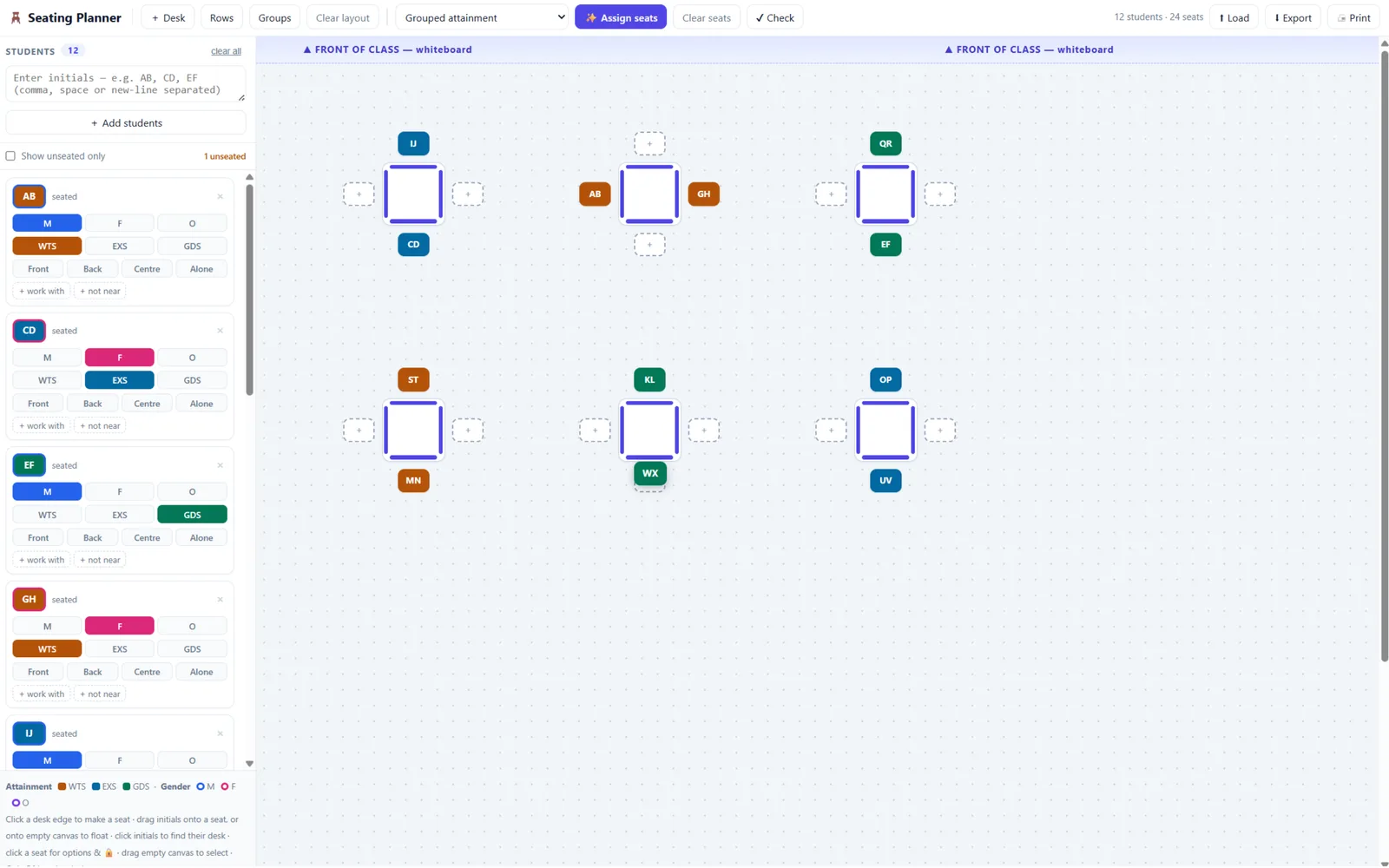
Class Seating Planner
Drag-and-drop classroom seating planner. Auto-assigns pupils to desks around behaviour, attainment and gender rules.
projects & experiments
A collection of projects, experiments, and things that probably shouldn't exist.
Drag-and-drop classroom seating planner. Auto-assigns pupils to desks around behaviour, attainment and gender rules.
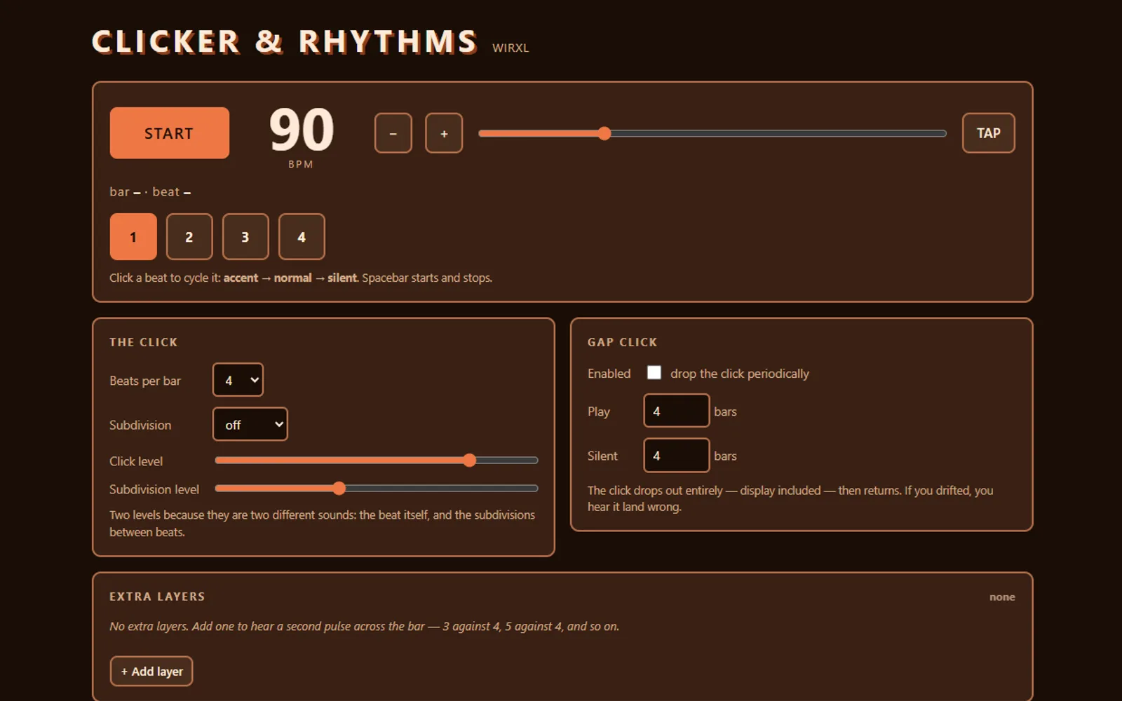
A metronome for drummers: odd time, layered polyrhythms, gap-click training and rudiments with live sticking.
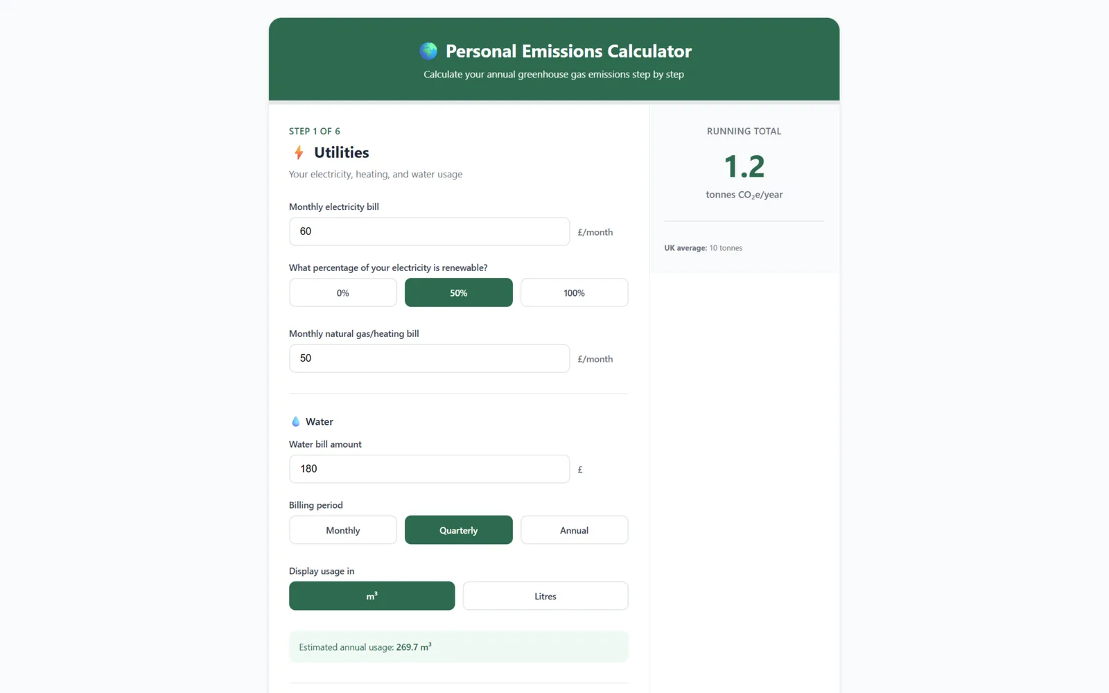
Work out your annual greenhouse gas emissions from your bills, travel and bins, using UK government factors.
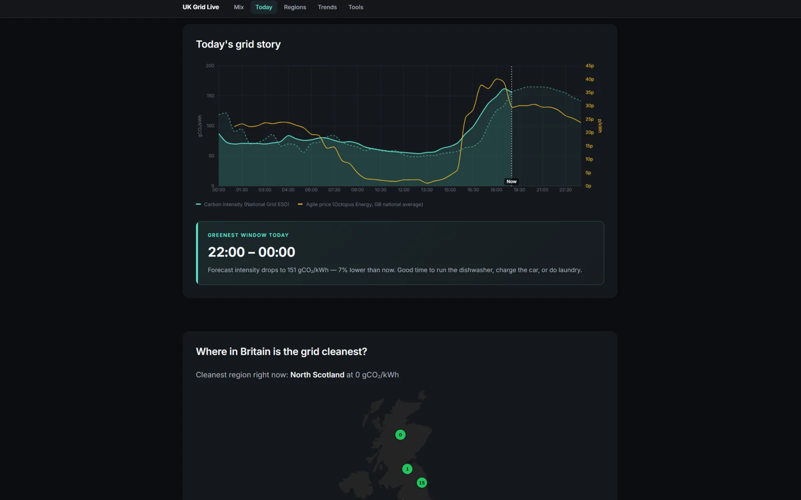
A live dashboard for Britain's electricity grid, plus tools and activities for learning where power comes from.
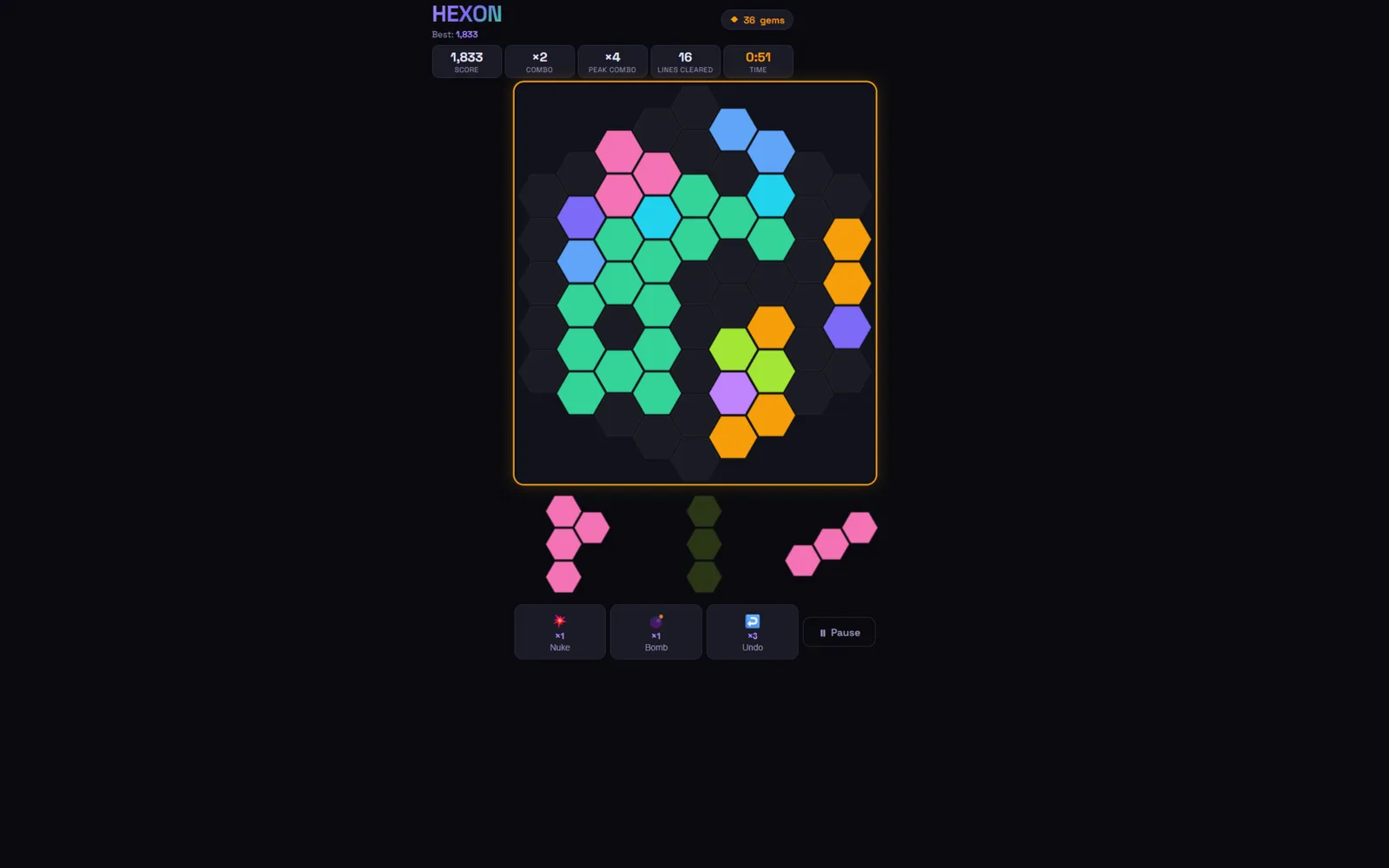
Place pieces on a hex grid, clear lines on three axes, chase combos. Three modes and a shop of over-the-top finishers.
A seating-plan builder for teachers that runs as a single web page. You draw the classroom out of draggable desks, tag each pupil with the things that matter, and it assigns everyone a seat that respects the rules. Plans save in the browser and export to a file you can reload later.
Seating a class is a constraint puzzle that gets re-solved every term, usually on paper with a lot of crossing out. The rules are easy to say and horrible to hold in your head all at once. Keep those two apart. She needs the front. Spread the attainment bands, except this pair genuinely work better together. By about the fourth rule you can’t move one child without breaking two others.
Computers are very good at this exact shape of problem. I wanted the whole loop in one place: draw the room, state the rules, let it shuffle.
One hand-written HTML file, no framework and no build step. Desks are squares on a snap grid, and any edge of a desk can be toggled into a seat. That single primitive turns out to cover rows, paired desks and group tables without needing a separate concept for each.
Desks sharing a border merge into clusters using a small union-find. Two children only count as neighbours if their seats meet on the same desk, or across two desks that touch, so the row behind you deliberately isn’t “next to” you. Deciding that rule took considerably longer than writing it.
Assignment is simulated annealing. Tens of thousands of random seat swaps under a cooling schedule, three restarts, then greedy sweeps until nothing improves. Every rule is a weight in one penalty function, and the weights are spaced far enough apart to form a strict hierarchy: locked seats never move, keep-apart and work-with beat the front/back/centre requests, and all of those beat whichever assignment mode you picked. A thirty-seat room solves in about fifteen milliseconds. Anything that couldn’t be satisfied gets listed in plain English afterwards rather than quietly fudged.
There’s no undo. Deleting twenty desks is one keypress and a confirm dialog, which is braver than I’d like.
The solver weights are hand-tuned numbers that happen to behave themselves. I’d rather they were derived from something than chosen by me.
Pupils are initials only. That’s deliberate, since nothing sensitive should be sitting in a browser tab, but importing a class list from a spreadsheet would save everyone the first five minutes.
Paste the class in as initials, separated by commas or line breaks. Tag whoever needs it: attainment (WTS/EXS/GDS), gender, front/back/centre/alone, plus not-near and work-with pairs.
Then lay the room out. The Rows and Groups presets cover most classrooms; otherwise double-click to drop a desk and click its edges to create seats. Pick a mode, press Assign, and read the seating check to see whether anything couldn’t be met.
Drag anyone you disagree with, lock the pupils who must stay put, and run it again. Locked children don’t move. Export writes the plan to a file you can reload next term, and Print gives you a landscape copy for the wall.
HTMLCSSJavaScriptlocalStorage
A metronome for drummers, built around the things a plain click can’t do. Odd time signatures, per-beat accents you set by clicking them, subdivisions, extra pulses layered across the bar for polyrhythm work, a gap-click mode that drops out for a few bars to find out whether you’re really holding time, and rudiments that show the sticking as they play.
I play drums, and the practice tools I actually wanted were all paid iPhone apps. PolyNome, Benny Greb’s Gap Click, Time Guru. They’re good, and they’re three separate purchases for things that ought to live in one place. Meanwhile every free metronome on the web is the same beeping box.
There’s a technical reason as well. Most browser metronomes are timed with setInterval, which drifts, because a JavaScript timer is not a clock. Over a long practice session you can hear it. That bothered me enough to want to do it properly.
The clock is the whole thing. Nothing is timed by a JavaScript timer directly. A timer wakes up every 25 milliseconds and schedules the next 100 milliseconds of audio onto the Web Audio clock, which runs on the audio hardware and is sample-accurate. The timer is allowed to be late, and often is. The clicks still land exactly where they should.
The page shows this working rather than just claiming it. A panel compares three numbers live: the jitter of the JavaScript timer, the accumulated drift of a shadow setInterval running the naive way, and the actual placement error of the scheduled clicks. Under heavy load I’ve watched the timer wander by 143 milliseconds while the placement error sat at zero.
Every sound is synthesised, no samples. The click is a square wave, the extra layers are woodblocks pitched below it, and the rudiments are filtered noise with a bit of body underneath. Getting the layers audible needed a rethink: the first version put them in the same frequency range as the click’s own harmonics, so they were technically playing and effectively inaudible, buried under the very thing they were meant to contrast with. Moving them well below the click fixed it.
Rudiments loop continuously instead of restarting each bar, so patterns whose length doesn’t divide the bar still play whole rather than being chopped off at the barline. Right and left are pitched slightly apart, so you can hear the sticking as well as read it.
It isn’t finished, and the two features that would make it genuinely better than an app are both still to come. Practice routines encoded in the URL, so a teacher can send a student a link that is the exercise rather than a set of instructions. And click-track export, for bands running in-ears.
The rudiment set is eleven patterns rather than the full forty. The scheduler should probably move into a Web Worker before this goes near a phone, since a backgrounded page can be suspended outright.
Set a tempo, or tap it in. Click any beat to cycle it between accented, normal and silent, which is how you get odd groupings out of an ordinary bar.
Add a layer when you want a polyrhythm. Three against a bar of four, then five against four on top of that if you’re feeling brave. Each layer has its own level and mute, and each gets a different pitch so they never blur together.
For timing work, turn on the gap click. It plays four bars and drops four, taking the display with it, and you find out quickly whether you were keeping time or just following the click. For rudiments, pick a pattern and watch the sticking highlight as it sounds. Accented strokes are underlined, and the small letter in the corner of a cell is the grace note of a flam.
HTMLCSSJavaScriptWeb Audio API
A seven-step calculator for your household’s annual greenhouse gas emissions. Bills, travel, bins, diet and spending go in. A number in tonnes of CO2e comes out, split by category, with a comparison against the UK average and some suggestions for bringing it down.
I wanted to know my own number, and got annoyed at every calculator I tried. They hand you a figure and no working. You can’t see which emissions factors they used, what year those came from, or which single assumption is doing most of the work.
The pre-filled fields bother me more. Load most calculators and every box already contains a national average, so you’re well above zero before you’ve typed anything. Everything here starts empty. Diet has a skip option, because not everyone wants to answer that question.
One static page. The steps are divs that get an active class toggled on and off. No router, no framework. Any change to any input runs a single calculate() that reads every field and recomputes the whole thing from scratch. Slightly wasteful, but there’s no partial state to fall out of sync, and the running total in the sidebar is never stale.
The waste section is the bit I’d point at. You give it bin size, how full it usually is when it goes out (up to 150%, for the weeks you put extra beside it) and how often it’s collected. That converts litres to kilograms at 0.15 kg/litre, then applies the DEFRA factors: 0.497 tonnes CO2e per tonne of residual waste, 0.673 for food and garden, 0.00469 for mixed recycling. Water works the same way, turning spend into cubic metres at roughly £2.67/m³ before applying the combined supply and treatment factor of 0.36218 kg CO2e/m³.
Results are drawn with Chart.js, reusing one chart instance and calling update() rather than tearing it down and rebuilding. The total also gets translated into things you can picture: phone charges, square metres of sea ice, trees, roughly what it would cost to offset.
Electricity, gas and shopping are all inferred from money spent, and that’s the weak point. The conversion goes stale every time tariffs move. It should ask for kWh and fall back to spend, rather than the other way round.
The factors are hardcoded in the JavaScript too. DEFRA publish new ones every June, so updating them means editing code instead of a data file. That will catch me out eventually.
Get your bills out first. Electricity and gas per month, water per bill along with the dates it covers, and a rough monthly figure for general spending. Transport wants weekly car mileage and what you drive, flights per year split into short and long haul, and for buses and trains the typical journey distance and how many you make a month.
For bins, the size is usually stamped on the lid, and 140L or 240L covers most of the UK. Note how often each one is emptied and estimate how full it goes out. Anything you’d rather not answer, leave at zero and it won’t drag the total anywhere. The sidebar updates as you go, so you’ll normally spot the category that’s dominating long before you reach the last step.
HTMLCSSVanilla JavaScriptChart.js
A single-page dashboard for Britain’s electricity grid: how carbon-intense it is right now, what’s generating it, what you’d be paying on a time-of-use tariff, and how all of that differs across the fourteen regional grids. A glossary and a live calculator sit alongside for anyone using it as a teaching aid.
I wanted to know when it was cleanest to put the kettle on. The Carbon Intensity API answers that, but everything I found built on top of it wanted to sell me a smart meter first.
It became a teaching tool almost by accident. The underlying question — where does this electricity actually come from, and does it matter when I use it — turns out to interest children about as much as adults.
Vanilla JavaScript with ES modules, no framework. Two public APIs do the real work: the Carbon Intensity API for anything to do with carbon or generation mix, and Octopus Energy for Agile prices, averaged across all fourteen DNO regions so the figure lines up with the national-level carbon view. Both are CORS-friendly and need no key, which is the only reason this can be a plain static site on cPanel with no backend at all.
Charts are Chart.js, with the annotation plugin drawing the “now” line. The regional map is a public-domain SVG silhouette of Great Britain with fourteen coloured dots on top, each one nudged by hand until it landed inside the right region. That was an evening I hadn’t planned on spending.
It refreshes every five minutes but only re-renders when the API’s to timestamp actually advances. The underlying data only changes every half hour, and there’s no sense making the charts thrash for nothing. Every timestamp goes through one module that normalises to Europe/London, because British Summer Time would otherwise bite twice a year.
It should show total generation in gigawatts, not just percentages. The data exists, but that endpoint doesn’t allow CORS, so I’d need a small server-side proxy. That would end the “no backend, no keys” story the whole thing is built on. Worth doing one day, not worth doing yet.
Open the page. The big number at the top is the current carbon intensity in grams of CO₂ per kilowatt-hour, and lower is cleaner. The donut underneath shows what’s producing that power right now.
The chart below plots today’s actual and forecast intensity against the Agile price, so you can see whether cost and carbon are moving together. Frequently they aren’t. The map gives the same intensity figure for each of the fourteen regional grids.
If you want to know what a single appliance costs and emits, the Energy Calculator multiplies wattage by hours by the live intensity. The glossary covers anything on the page you didn’t recognise.
HTMLCSSJavaScriptChart.jsCarbon Intensity APIOctopus Energy API
A hexagonal take on the 1010 / Trigon line-clearing puzzle. You drag pieces onto a 61-cell hex grid and clear lines along three axes instead of the usual two. Three modes: Classic, a two-minute Timed run, and a Daily Challenge seeded from the date. Gems you earn feed a shop of deliberately theatrical one-shot power-ups.
I wanted a puzzle game that didn’t feel like every other square-grid one, without inventing something nobody would understand on sight. Hexes clear on three axes, and that one change makes you think differently about every single placement.
It started as a test of whether I could make hex geometry and line-clearing feel good to play. Then it kept growing, because each idea suggested the next one. Combos led to power-ups, power-ups led to a shop.
One HTML file, vanilla JavaScript, drawing straight to a canvas. The grid uses cube coordinates for the hexes, which is what makes three-axis line detection manageable rather than miserable.
Rendering scales by devicePixelRatio so it stays sharp on phones, and every drag coordinate has to divide back out by that same ratio to make the touch position agree with the board position. That alignment was easily the fiddliest part of the build. I eventually abandoned the floating “ghost” piece under the thumb altogether and replaced it with a semi-transparent preview on the board itself, offset above where your finger is.
Leaderboards run on a small PHP backend that reads and writes flat JSON files, top 50 per mode. The Daily board gets its own date-stamped file, created the first time someone plays that day. Everything else lives in localStorage: gems, high scores, unlocked themes, frenzy inventory, audio preferences.
The particle system checks core count and available memory, then scales its particle counts and frame rate to match. Low-end phones choke on the bigger clears otherwise.
Score submission has no server-side validation, so the leaderboard simply takes the client’s word for it. Fine while it’s a toy. Not fine the moment anyone actually cares about the board.
The Chain Reaction power-up traces a scrappier path across the grid than the clean pattern I had in mind. I shelved it as too fiddly for the payoff, and it still nags at me.
JavaScriptHTML5 CanvasPHPCSSlocalStorage